Friday 30 January 2009

Location Decision

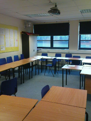
We took a walk around the school to find some classrooms that would be suitable for the filming of our opening sequence. We decided that the room would be either G12, G13, G19, and C125.

We decided that C125 would not be appropriate because the room is upstairs and as we were using the dolly and it would be difficult to get the dolly upstairs.

All of the other 3 rooms were suitable and all we needed was a period within the school day when the room was free to film in. We also thought that it would work to use a room after school as there is no classes held in the chosen rooms after school and would therefore be easier to acquire.

Labels:

Location Pictures


Labels:

Animatic Storyboard

Labels:

Wednesday 28 January 2009

Shot List

Shots 4-12 of the title sequence will all be done at the same time using the Dolly. These will be done first to get it out of the way.

Shots 2 and 3 of the title sequence, 7,8,9,10,11,12,13 and 14 of the opening sequence all contain a door so will be filmed at the same time.

Shots 1-6 of the opening sequence will all be filmed in the classroom.

TS: title sequence
OS: Opening sequence

Order of filming:
TS shot 4 - Mid shot of table. Sticker on table saying "Ollie Buncombe"
TS Shot 5 - Mid shot of table. Sticker on table saying "Beth Walsh"
TS shot 6 - Mid shot of table. Sticker on table saying "Nicola Hartley"
TS shot 7 - Mid shot of table. Sticker on table saying "Vincent Lin"
TS shot 8 - Mid shot of table. Sticker on table saying "Produced by Vincent Lin"
TS shot 9 - Mid shot of table. Sticker on table saying "Music by Dan Sparrow"
TS shot 10 - Mid shot of table. Sticker on table saying "Filmed by Nicola Hartley"
TS shot 11 - Mid shot of table . Sticker on table saying "Edited by Beth Walsh"
TS shot 12 - Mid shot of table. Sticker on table saying "Written by Ollie Buncombe"

Writing on the stickers will either be hand written or printed.

TS shot 2 - Long shot of detention door. Zoom in on top half of door to show detention sign.
TS shot 3 - Mid shot of open door. Camera tracks into the classroom.
OS shot 7 - Mid shot of boy standing in doorway wearing casual clothes and a backpack.
OS shot 8 - Mid shot of boy standing in doorway. Girl comes up behind him also wearing casual clothing and backpack.
OS shot 9 - Close up of boys face smiling nervously. Door behind his head.
OS shot 10 - Mid shot of boy moving towards the door.
OS shot 11 - Mid shot of girl walking towards the boy. Corridor and door behind them both.
OS shot 12 - Mid shot of boy reaching to lean on the door and falling out of the shot.
OS shot 13 - Mid shot of girl looking down and walking out of the shot laughing. She starts on the left hand side of the shot and walks out of the frame on the right.
OS shot 14 - Mid shot in exactly the same position as previous shot. Boy 'appears' in the shot on the right hand side looking embarrassed.
OS shot 1 - Mid shot - High angle of boy asleep on desk on top of an open textbook. Boy wearing casual clothing.
OS shot 2 - Close up - Side on shot of boy with a piece of paper stuck to his face.
OS shot 3 - Close up - Side on shot of boy peeling a piece of paper off his face.
OS shot 4 - Close up and upward angle of piece of paper laying on top of an open textbook. Writing on paper written in red ink.
OS shot 5 - Close up - Side on shot of boy looking down. Cant see what he is looking at.
OS shot 6 - Mid shot - Camera looking down at the backpack that the boy is packing up. On the table are pens, pencils and rulers.

Labels:

Presentation Pitch

On 27th of Tuesday, our group was required to present the two analysis of a film opening, the mood board and our film opening's synopsis.

We managed to get through all the criteria except the mood board as we had technical difficulties with the pictures appearing. So instead we decided to present our storyboard and explain our synopsis from there.

The feedback we received:

Positive

- Good setting for genre
- Good camera work ideas for opening project.
- Detailed description of story idea
- A twist convention for plot (guys after the girl)
- Relevant films for analysis
- Happy to interact with audience *thumbs up*
- Gave explanations for why they included those ideas

Negative

- No mood board :(
- Didn't explain the genre we were doing at the beginning
- Went off track with the analysis. (Not the opening sequences of the film)

Labels:

Props, Location and Costumes.

Props
Dolly
Textbook
Tables
Name cards
Backpack
Pens
Paper - notes

Location
Classroom - English classrooms or D block
Corridoor - Continuity from the English classroom

Costumes
Casual Clothing

Labels:

Tuesday 20 January 2009

Analysis of Love Actually / A Cinderella Story

As evidence for our preparation (Pitch), our task was to analyse two clips that have a similar scenario to our idea. This is so that we can think about the main key conventions used in RomComs with the basic elements including mise-en-scene, editing, sound and camera-work.


Love Actually - The scene starts off with the girl in her house and she appears to be wearing white which matches the exterior color of the house. This use of mise-en-scene is meant to represent the female gender as being the monumental attraction. Another interesting take is the lighting of the conversation. On the girls side she has a bright glow where as the man doesn't have any lighting surrounding him. This contrast is used again to make the girl seem special and superior where as the man is made to look inferior by having a dark background. The use of camera work is also prominently used to present the characters in a specific way. The over shoulder shot with the man is used to show he's in a weaker position by exposing more of his body with a slightly tilted high angle shot. In vice-versa, the shot of the girl is slightly low angled but shows less of the mans figure in the right to show her superiority.


A Cinderella Story - The mise-en-scene presented in this scene is used in a variety of ways. An example would be the boy constantly looking around behind his friends for back up which tells us that he's looking for help. This puts him in a weaker position. As for the female character, she appears to be very dominant. This clue is exhibited by how she abruptly marches into the men's changing room and looking bossy at the same time. She is also positioned in the middle of the frame during the conversation which suggests that she is the center of attention. The background of boys are staring at her as well which is blurred out in order to concentrate on the female and male lead. The use of music is merely non-existent as there is no non-diagetic soundtrack. The sound is focused upon the conversation between the character leads with the occasional use of murmur and school locker sound effects to set the scene out as if it were a school teenage genre.

Labels:

Friday 16 January 2009

Final idea for storyboard / synopsis

We have chosen to do the romantic comedy aimed at a teen audience as our ideas and group dynamic suited this style of film. After looking through all of our ideas we chose to combine two and storyboard the idea below.

We didn't choose to use ideas 2 and 3 due to the location of the setting. We don't have an apartment or a house that all members of the group can assemble at. Instead of using these ideas we chose to combine parts of both idea 1 and idea 4. As well as ideas 2 and 3, we had the problem of location with idea 4 too but we thought the plot of this idea was funnier and therefore may be more suitable to the genre than idea 1, so we fused the two ideas together.

Idea 5.
It opens with a shot of a door with a detention sign on it. The door then opens and the room inside can bee seen, the camera is mounted upon a dolly and it enters the room. Whilst in the room it pans and tracks over desks, on the desks are peoples names and other pieces of information that are included in the titles of an opening sequence from a film. The camera eventually settles with a high angle shot inside of the room over a boy asleep on an open textbook. He wakes up, sits up and has a piece of paper stuck to his face.

The shot then cuts to the side with a shot of him with the paper still stuck to his face and peels it off from top to bottom and puts the paper on the desk in front of him. The piece of paper has a girls name repeatedly written on it. The following shot cuts to a side on shot of his face,and the girls name is written back to front on his face. A bell rings and he begins to pack up. The next shot cuts to the outside, the door opens and he walks out and sighs.

Still standing in the doorway, a girl comes up behind him, taps him on the shoulder and says 'excuse me'. He goes to hold the door for her, misses the handle and falls out of the shot. He stands up again and holds the door and she walks past, staring at his face and giggles. Last shot is of him leaning on the door, putting his head up against the door, sighs and says 'smoooooth'.


We think this is suitable because the location, actors and props are all available for our use and the conventions of the genre are present in the sequence.

Labels:

Production Logo Deveolpment

We decided to use the 'splat' idea for our production logo. We started by finding an image on Google images and edited it within photo shop. At first we changed the color of the 'splat' from black to a bright blue. We left some of the black paint splatters around the edges to make the splodge more interesting and not cliche with bland colors. Within the splat we have the writing 'Childish Inc' in a variety of colored letters, all spaced apart but not in line and in different cases. We experimented with a lady bird but most members of the group decided that it wouldn't be suitable as we couldn't properly edit it to match the desired effect. We chose not to animate it because we felt that it would be unnecessary. We think that our logo is bright, eye catching and fun which is suitable for the comedy genre.

Labels:

Wednesday 14 January 2009

Possible Ideas (Production company logo)


The thinking behind this logo was initially this style because we were doing a RomCom aimed at a Teenage based audience as the theme would be fairly "low brow". This is because it is aimed at a teenage audience who would be of a level that could be considered low brow.


This idea was based around conventions that would be apparent in most real production companies. This was based around the idea of conjuring up happy memories.


This idea was our old production company name and I thought it would be interesting to see how it looked.


No Exit is a symbol on a t-shirt I was wearing at the time and I adapted it to look more and more like a classic production company logo.


Insomnia is the name of a party I went to a few months ago and I thought that the name would be fun to make in to a logo.


Wild Hog is the name of the film I was watching when I decided to draw this logo, also it is an image that I have drawn many times before.


Backwards is a song that I was listening to and so therefore chose to take its name and draw it as a logo.


I chose to draw this as I thought it would be interesting to experiment with words that have the same letters in as other words that when combined make an interesting phrase.


Blue flash is the name of the company I worked for until they lost all their money and went bankrupt.


Homesick Angel is an idea I came up with as I was watching James Mays 20th century. He was flying a euro jet and he was quoted as saying that it "flies like a homesick angel"


I came up with this idea whilst I was playing around with the idea of photographs edited in Photo shop.


This is the idea we eventually chose as we felt that it was the one that most represented our group dynamic.


We chose to take the paint splodge idea out of this picture and incorporate it to the childish inc writing from the picture above and put it on the paint splodge.

Labels:

Features of Production Company Logos

One of the general conventions of film logo's is that they are animated and are accompanied by sound. An example of this is DreamWorks SKG, where the sequence depicts of a boy sitting among the moon where this later animates to the DreamWorks title with a mix of cloudy and watery ripple effects to set the tone for their film.

The Universal Logo's name represent its logo in the fact that it depicts the Earth and the universe behind it. The music accompanying the short sequence varies from film to film. This helps entice the audience and makes them want to pay attention and watch the film. This is due mainly to the amount of work put into animating the text and the CGI involved.

In general, many of these logo's are representative of many aspects of the earth. These features that we would associate are usually grandeur or on a massive scale. Many of the titles show cloudy skies as a representation of importance. The importance of these chosen aspects could well mean these films are made to be high on the A-list for cinematic release.

Labels:

Tuesday 13 January 2009

Possible Ideas (Story/Plot)

Teenage Romantic Comedy

Idea 1. -Ollie (storyboard present)
Set in a classroom. Two characters: male and female. Voice of teacher in background. Female character sitting at desk in classroom doodling about a boy she likes. She looks at the boy and smiles and he smiles back. Sound of a bell ringing, everyone packs up and boy quickly walks out. Girl tries to catch up but falls over. She turns over while laying on the floor and looks directly into the camera. Then a monologue voice over begins, this is supposed be representative of her feelings and a representation of what she is thinking about.

Idea 2. -Beth
Set in two different bedrooms (a boys and a girls). Two characters again: male and female. First shot of girl turning of an alarm clock. second shot of boy turning off an alarm clock. Alternates between girls actions and boys actions following them getting ready for a day at school. Towards the end of the opening both characters come out of their houses at slightly different times and just miss seeing each other. Hints towards them meeting each other at some point within the film.

Idea 3. -Vince (storyboard present)
Set in a rural suburb. Three university male students who are friends move into a new apartment. Two of the trio have already been dumped by their girlfriends with the exception of the remaining one who is moving in with his partner. As the two bachelors sulk, the last of the trio gets dumped immediately right after he was done fantasising (voice over). The three friends walk out of their apartment with bleak expressions as the last of trio's girlfriend walks off. This leaves the boy's thinking about how they can pick themselves up when they all simultaneously lost their long-term relationship.

Idea 4. -Ollie
Based on a boys perspective, in this rather than the girl being the geeky unsuccessful in love person, this character is exchanged with a male character of about 16/17 years of age. The scene opens with the boy in his bedroom, he then see's a girl in the street and attempts to look 'cool' by leaning against a wall, he misses the wall and falls over. The girl walks past laughing and then the titles appear.

Labels:

Wednesday 7 January 2009

Features of the Sin City Opening Sequence (Analysis)

The opening sequence is initially very enticing due to the fact that its color is in black and white. There is very little action from characters at the start. However, this opening sequence culminates with the death of one of the two characters first shown. Also the opening sequence is established from a roof top where a vast amount of the city can be seen. The establishment shot is a long shot of the female character walking upwards within the frame with the city in the background. This helps set the tone of the film as the audience will be aware of the location and foreshadow the film's plot.

The openings mise-en-scene is generally fleshed out and well presented. This is due to the high exposure of black and white colors. The female character is seen wearing a red dress which help's us to appeal to the first character on screen. As for the camera-work, we are given an immediate mid-shot of a conversation between the female and a newly introduced male character. This way, both genders from the audience will be attracted to the situation.

This opening sequence with the woman in the red dress could be cross referenced with another film also shot in black and with with only small elements of color. The film is called Schindlers List and it is set in Nazi Germany. There is only one use of color in this film and it is the color red, it is the color of a young child's coat and is first seen during a sequence where a Nazi raid is taking place and many people are being shot. Later in the film you find out that the young girl has been murdered and her body is being burned, this moment is being made more poignant due to the significant use of color. The comparison between the two films could be that although it is not immediately apparent at the start of the film, both people are going to die. As such color is used in both these films to represent death or that a bad event is about to take place.

The opening sequence has been edited a lot to get the effect of a black and white shot with a little bit of color. The red color, as well as signifying death, could also imply a sexual meaning (Sin City).

Labels:

Genre selection

The 5 scenarios given to us were:
- Supernatural thriller with a strong female lead
- A British social realist drama
- An adventure story for younger audiences
- A teenage romantic comedy
- A crime caper with an ensemble cast.

We chose the teenage romantic comedy because we felt that that the other options had problems that we felt we would struggle to overcome. The supernatural genre was our second option but we felt that we would be heavily relying on props and this could potentially cause problems if the suitable props could not be found. We felt that the British social realist drama was also unsuitable because it would be difficult to act out. The adventure story for younger audiences would be best created with a child playing the protagonist and as we do not have a younger sibling this would also be an unsuitable option. We chose not to do a crime caper with an ensemble cast because we could not think of any satisfactory ideas. We therefore chose the teenage romantic comedy because we could get the actors easily, not many props would be needed and we could set it within locations the whole group can get to. An example for our setting would be our own college, making filming very convenient.

Labels:

Sin City Opening Sequence

Conventions of Film openings

Titles: Production company logo, Actors, Editors, Scriptwriters, Producer, Music composers, Film studios, Director.
Establishing shot: Shows location, first introduction to setting and characters with some possible action. Establishment is often re-called by an extreme long shot. Sometimes the shot may have a text indicating the location and the time film is set.
Protagonist: Film openings generally include the main character and try to give the audience an impression of the characters personality and motives. Sometimes there are support characters that may appear with the protagonist.
Music: Reflects the mood and genre of the film. For example, fast paced music for an action film. It allows the audience to feel empathetic to the movies plot, character and world.
Incident that sets up a larger narrative: For example, if a characters friend is murdered it can be developed into a more complicated storyline. Thus triggering different events to occur, such as contemplating to avenge his deceased friend.
Voice-over: Often the protagonist explains what may be expected later in the narrative or what may have happened in the past. There may be an omniscient narrator telling us the event's regarding the past, present and future of the film.
Mid-Action: The opening sequence can often start mid-action.

Labels: